Wednesday, 28 November 2018

Personas for my amazon app

Persona - Aspect of someone's character that is presented to or perceived by others

Mother - 

- Has a teenage child who has most things already and does not let onto parents anymore what they are wanting for their birthday.

- Busy lifestyle with a full time job. For this reason mother does not have much spare time to browse the shops.

- Likes to chat to other mothers with children of similar age groups for inspiration

- Middle - class

- Family oriented

- Works in an office

-Travels to work by train / public transport due to working in a city

- Likes to buy everyone in the office a present as a pleasant gesture but does not like to make a fuss asking them what they would like directly.


Teenager -

- Highly social media orientated

- Likes the comfort of shopping from their bed

- Hates browsing the shops in public

- Loves looking at things online / is constantly browsing for new gadgets / item

- Not much interaction with others in person

- Likes using amazon because it is cheap and cheerful and has pretty much everything!


Tuesday, 27 November 2018

Industry Professionals - Only

Branding agency

Clients - Goldsmiths, Design Council, Sony Music, Mercedes, Broadwicklive, Helbers PARIS, The British Academy

Design For Screen 

Primary means of consuming a brand
Constantly evolving
Fast pace
Experimental/ interactive
It's here to stay
Motion used to get brands point across and create character

Inspiration 

Phase 1 - Research 

Competitors
Audiences
Personas
Principles - Guide small principles for the website / app design

Phase 2 - Wireframing 

Ideation
Test assumptions
Client buy-in

Phase 3 - Design


Monday, 26 November 2018

Amazon - Adding images and multimedia


Using the Amazon app myself - personal opinion


 Amazon home-screen 

1. When opening the Amazon app this is the first page I as a user sees. Due to the app being for all occasions and personal shopping the design is busy and does not instantly connect with birthdays which is what I intend to achieve. 


Amazon menu 

2. The app offers many options for users to explore. One would argue there are too many options for the user and some could fall under the same bracket. For instance 'Your Account' could contain orders and 'Your Wish List' as well. 

 Your Orders 

3. I like the layout for 'Your Orders'. I feel this is really simply structured and clear to use. It also gives the users options where they only have to click one button to achieve what they want to achieve such as writing a review, view order details and but it again. This also caters for mixed users with different skills sets for technology experience. The app is easy for everyone to use! 

 Wish List 

5. I feel the wish list needs to have an added category where other accounts can see your wish list and purchase the products for you, without you knowing so it can be a surprise! However, to stop several users buying you the same product other users should be able to see once this product has been purchased. This could be shown through the product on the list being dull/ desaturated. The header at the top of the page also allows the user to get back onto the previous page. I feel this is a design element I will keep for my app. 


Your account 

6. This allows the user to look up all their account settings as well as elements for their personal profile with one click of a button. 


7. My app could instantly connect to amazon so the user has to log in to amazon from the amazon app itself or website. 


Amazon Guide lines - Amazon mobile for iPhone, iPad and iPod Touch

AMAZON MOBILE FOR IPHONE 

Amazon like claim to be:

COMPREHENSIVE  - 'Quickly search for millions of products available from Amazon.co.uk and other marketplace sellers. 

CONVENIENT - 'Take advantage of 1- click ordering, Prime member support, wish lists, order tracking and more.' 

FAST - 'Scan a barcode to instantly compare prices an check availability.'

SECURE - All purchases are routed to Amazon's secure services. 


Documenting your journey - design boards

Rationale - 

Design for print - Brief, why this brief? Could comment on summer project and ideas for this ... how it led to this rationale.

 Design for screen - why did you want to solve this problem?

Research - 

- Research conducted
- Research methods (appropriate)
- Include primary and secondary research
- Information, media, format, content
- Research into production methods
- Could include foot notes

Initial ideas

- Sketches
- Tests
- Mind Maps
- Make sure these are in response to your brief
- Justify which is the best
- Can use foot notes ... got to blog xyz

Development 

- Experimentation
- Iterations of the same ideas - images and captions - evidence your development
- Aim of development - What were you trying to achieve
- You may need multiple design boards for this
- You can use 1st person!
- Limitations of technology
- Appropriate media

Final outcome 

- Evaluating development
- Refinement
- Professional designers
- Photographed well and clearly communicates ideas
- Design for screen - Mock-ups. Prototypes.

Evaluation 

- Reflecting the module as a whole - what worked what did not
- Opportunity to discuss potential and limitations of production methods. ( Potential limitations of facilities)
- Evaluate against learning outcomes

TOP TIPS 

Using images with captions - evidence your process
- Evaluating points: why? ... The result of this?
- Say it how it is - What happened. Don't brush past mistakes - evaluate what happened and how it is solved.
-  Story - linear narrative
- Edit - to clearly communicate process. If there is a paragraph of text make key point clear (bold?) make processes as concise as possible.
- Convincing ... appropriate.


Digital Wire frames feedback

- Stick with the colour palette amazon already uses - maybe introduce a new colour to differentiate and think of gender neutral colours to appeal to a wider audience.

- Keep the typeface as Helvetica

- Expand gift wrapping to packaging as well - e.g gift bags - can you buy the gift pre wrapped? - amazon already offer this but could the gift wrap be custom?

- How are things added to the wish list?

- Are there still reviews on products like amazon online?

- Is the profile just for yourself or for others as well?

- Could add amazon suggestions for gifts

- Make sure you follow amazon branding guidelines

- Is the gift finder / event finder for everyone or just amazon prime users only?

- Do amazon incorporate a gird system?

- Usability and UX is strong

- You could change the hue of amazons colour scheme to keep the app related to amazon but make it stand out. ( Think about Facebook and Facebook messenger)

- Keep the typeface simple

- Consider the corners of button and image boxes to be the same. Either rounded or sharp edges.

- How does the app know when it's peoples birthdays?

-  Make the event organiser clearer

Monday, 19 November 2018

Typography layouts for my final publication design


The following designs have been created to resemble traditional Blackpool posters in the 19th century when Blackpool became most popular due to edition of the train line connecting Blackpool to other northern places. 


Birthday Bitmoji


Initial ideas for app design...

Create an app which records birthdays/ events. This app could have character profiles for the users friends and family in partnership with bitmoji. This app could have accessibility for the user to see what their friends/ family want for their birthday and could link the user up to websites with desired gifts at their lowest cost. The app would also be able to send out birthday cards and thank you cards to other character profiles which the consumer has as a friend within the app. Character profiles can also share images from events if they have attended them.

Design Development for my final publication

It has been decided that my final publication will be a wind breaker. This is to instantly connect my audience to the seaside due to Blackpool being the UK's most popular seaside resort.

Within group critiques peer voted that they liked the concertina element as a publication design as it was a playful, fun approach fitting the topic of my publication and breaks boundaries of a generic book/ publication. 

Other materials were also put forward to make my publication design more interesting. When showing already created designs peers liked the use of sweet bags as claimed it instantly connected traditional with the town 'Blackpool'. 

When relating back to my taken images for primary research of 'Blackpool' it was decided that these images worked well as 'holiday snaps' to be included with my publication. Several paper stocks were experimented with for printing images onto, however, glossy stock worked best and instantly connected to tourists and the actions they take on holiday. 

As the sweet bags I gathered had printed seems on them a design decision to stitch my publication together down the seems was made to give my publication more of a textured feel making it more interesting and visually pleasing for the consumer. 

Stephanie Bell - Profesional presentation

Senior designer at Social Change 

Conceptual thinking
Creative direction
Brand development
Web design
UX/ UI

Digitally Native - What we are seen to be

On average a person spends 2 1/2 hours on their phone

When making a digital design you should think about designing for a phone screen first as more people use phones first in comparison to other digital devices.

UX - how the users would experience your website

UI - how the buttons, colours etc fit together and function

AB testing - test diffrent coloured buttons on several uses to see what is the most effective

Graphic designers - $41 dollars a year in comparison to $70,000 a year as a UX designer

PROCESS

Brief - Ideation & Decision - low fidelity wireframes - Feedback - High fidelity wireframes / version one - Feedback - Refinement - Prototype - Build

IN HOUSE 

- Microsites and landing. pages for data capture and short campaigns
- Full Websites and e - commerce sites
- Progressive web apps
- Interactive quizzes

OUTSOURCED 

- Games
- Animation
- Mobile Apps

SKETCH  - caters for all devices with it's templates.
Sketch mirror shows desktop work on your mobile device.

What makes a good app?

Clean, minimal, paired down colour pallet. Apple guide lines.
- Something that allows you to do what it is designed to do quickly

Online courses - UX FOUNDRY  

Use post it notes to structure your design


Thursday, 15 November 2018

Industry professional - Adam Griffiths


Designer and Curator 

STUDIO - WWW. ra-beer.com 
transient_space 

Exhibited work 

- Compared original images with google images to make a miss-representation of the gallery show / of artists work. The work was the formatted into a catalogue and they layout referred to the google images layout. 

- Screen shot images which were loading on Instagram to get an abstract effect in order to create another publication.Represented space between two things.  

- Miss matches screen with print 

Curator of 'Transient Space' - digital gallery exploring the concepts of time, space and the culture of the transient screen. 

Screens in different places have different reactions. How the screen is present impacts the reaction as well.

"Recent research shows the average time people look at a work in a gallery is a median duration of 17 seconds." 


WORKSHOP ...


The following video I created for Adam Griffith's workshop. The workshop was designed for us to create a punchy, bold design 5-10 seconds long based upon the theme DISRUPTION.  The following pop corresponds to the idea of 'disrupting' an image. 


Monday, 12 November 2018

UX vs UI

UX - Google says 'is the process of enhancing user satisfaction with a product by improving the usability, accessibility, and pleasure provided in the interaction with the product.'

UI - Google says 'The space where interactions between humans and machines occur.' 


Introduction to studio brief 2

Deadline - 7 / 12 / 19

- Client
- The problem 
- The target audience 
- The overarching aim of the project ( what are you trying to achieve) 
- References
- Tone of voice 

PERSONA - representation of a particular audience segment for a website / product etc. Personas are based on real users. Think about Instagram starter packs for these people. 

Use mixed media - A combination of image, audio and video should be considered in your design strategy. 

Think about how you can develop things that already exist rather than just remaking them. 

Research ONLY studio 

Editions at play - books which are designed for screen and can not be printed 

Universal Everything 

Thinks which you could do ...

- App to go along side an existing experience 
- Used by app - responding to own personal needs (food) 
- Manifestos 
- Design tools

Develop appropriate strategies for the investigation 

- Think about the media it will be communicated by - explain considerations. Format, how it's delivered. 

Working/ animated / navigable prototypes 

Wireframe - basic layout/ story board/ Skelton of the layout 

Think about user ability 

Unsplash - provide high quality stock images 


Sunday, 11 November 2018

Starting experimentations for my publication on Blackpool

Due to the target audience being tourist, a necessity for the publication to be easily assessable and transportational was decided. For this reason the starting design approach is scaled to be a pocket sized publication that is visually engaging and gives of a true interpretation of Blackpool.

Tuesday, 6 November 2018

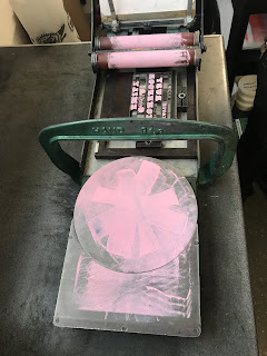
Letterpress induction

Letterpress originated in the 15th century and was the primary source of printing for 500 years. Today it has been replaced by offset printing. Letterpress is a highly elegant way of printing which is why it is still often used to formulate invitations, business cards etc. 

'Letterpress printing, also called Relief Printing, or Typographic Printing, in commercial printing, process by which many copies of an image are produced by repeated direct impression of an inked, raised surface against sheets or a continuous roll of paper. Letterpress is the oldest of the traditional printing techniques and remained the only important one from the time of Gutenberg, about 1450, until the development of lithography late in the 18th century and, especially, offset lithography  early in the 20th.' https://www.britannica.com/technology/letterpress-printing offset lithography 

'Letterpress can produce work of high quality at high speed, but it requires much time to adjust the press for varying thicknesses of type, engravings, and plates. Because of the time needed to make letterpress plates and to prepare the press, many newspapers have changed to offset printing.' https://www.britannica.com/technology/letterpress-printing offset lithography 


- Draws are laid out with letters next to each other that are most common. Vowels have the largest areas and E has the most space in the draw due to it being the most common/used letter within the English language.

- Capitals are in alphabetical order within the draws as they are only used at the beginning of a sentence. U & J stand alone because they were the last letters added to the alphabet.  


Chasers - the frames 

Composing Stick - Helps set the type and is easy to transport

REMEMBER - All type is made out of led, therefore, it can be poisonous for us so hands need to be washed straight away after handling it.


Leading - For the line spacing

Furniture - Wood and metal is used to slot everything into frames. Through centre force the type stays in place inside the frame.

At the bottom of each letter theres is a groove and letters are also backwards so they print the correct way. For this reason extra care needs to be taken when handling letters such as lowercase 'b' and 'd'.


- Anything that is not raised will NOT be printed. 

- It is easier to start with longer line lengths and to stick with one length of leading. 

- When setting out type it is easier to work upside down going from left to right. This is easier to set all of the design out. 

- It is important that you don't treat the chase as your page as it is entirely down to you how you line up the paper with the letters. 


- Only one colour can be used on the smaller letterpresses due to the spinning ink palette. Alternatively on the larger letterpress multiple colours can be used creating gradients. 


Monday, 5 November 2018

Typefaces to consider using and their historical background/ uses

Cooper BlackOswald Bruce Cooper created the typeface in 1921 in Chicago. The typeface was made to be intended for display use. It also was advertised according to Cooper " for far-sighted printers with near-sighted customers" as a display font for advertisements. Stephanie Vivirito (2012) states 'Its lack of contrast, oversized and curved serifs, and exaggeration of every feature gave the term "heavyweight" a new meaning. At the time, Cooper Black was the blackest and boldest type around, which allowed  it to function in an endless number of ways. Identified as an extra bold roman styled font, graphic designers used the type like it was going out of style.' 


Stephanie Vivirito. (2012). cooper black . Available: http://snvivirito.wixsite.com/fonts/who_we_are. Last accessed 6thNov 2018.


Circus Fonts - 


In the middle of the 19th century posters were needed to stand out during the ongoing industrialisation and urbanisation. Printing was a huge issue due to it being costly particually when printing illustrations. For this reason fancy typefaces such as circus styled typefaces were created to make posters stand out which today are classified as tacky typefaces.  


MasaKudamatsu. (2018).  claimed via a twitter post that 'All different elaborated typefaces represent circus features. They create a sense of a variety of fun that comes with the circus.' 

MasaKudamatsu. (2018). Circus fonts (and the birth of sans-serif fonts).Available: https://medium.com/@masakudamatsu/circus-fonts-and-the-birth-of-sans-serif-fonts-e9a9c068ffcf. Last accessed 6th november.

Brim Narrow - Inspired by antique wood and chromatic type from 1800s, eye catching effect. 

Enrich Display Typeface - Inspired by vintage magic shows of the late 1800s and early 1900s, it is a great typeface for posters, labels and logos. 


Friday, 2 November 2018

Final Crit - Comparing work with learning outcomes

- Refine information - can things go on the back of the publication?

- Decide what you want your publication to be? Is it just a toy or is it a souvenir / information guide as well

- Refine the purpose of your publication

- Can you put different stocks in the middle of the publication with facts/ information on

- Look at the images you have gathered/ captured and see what facts you can pull out about them and incorporate them into your publication. This could be on the back of glossy images.

- You could also put different stocks in the middle of the publication with facts/ information on them whilst still having the publication as a windbreaker.

TO WORK ON THE MOST... 

Select, manipulate and apply appropriate media, processes and technologies in the development, production and presentation of design solutions for print.
(Practical and professional skills) (Technical competence / critical awareness) 

Thursday, 1 November 2018

Colour Management Workshop


There are two colour modes CMYK AND RGB

CMYK 

- Print
- Ink on paper
- Subtractive
- ( 100% of all inks = black)
- Not all colours are reproducible for CMYK

RGB

- Light of monitor. projector etc
- Addictive
- (100% of all light = White)
- Has a wider gamut than CMYK. This is most obvious when using brighter colours.

- Photoshop works faster in RGB. Also the default mode for Photoshop is RGB so working in CMYK  reduces the adjustments you can use and makes the programme run much slower!

- Proof colours show what CMYK would look like whilst still working in RGB

- Gamut warnings on view represents any colour that is out of the CMYK colour mode. Adjustments can be used to change this.

- Proof colours can be used working CMYK

-  ! triangle stands for outside the RGB / CMYK spectrum. Always work within the warning or else it will change once you print.

- Unlike Photoshop illustrator works comfortably in CMYK.

- Swatches are useful to use as they make sure there is consistency across designs

- Random colours can be used to fill and deleted unused swatches. To do this you can select and create own swatch and unselect global and you are done!

RGB in Illustrator 

- You should click into the colour mode to see if there is a gamut warning. If it not showing then you can change the document into a CMYK document with no change.

When printing designs you should ask yourself where am I getting this printed?

- Check with the printers what resources they have as some printers have better resources than others so can print a wider variety of colours.

- Pantone match system ( RMS) is a presumed coloured ink. It helps provide an accurate representation reaching outside of CMYK colours. This is highly useful in branding for instance McDonalds will use this so their logo is the same colour everywhere!

- Pantone has 14 base colours and transparent white. If the colours can be printed CMYK has 4 dots.

- Colour library to show Pantone

- Coated and uncoated = paper

- Indesign - create new swatch, drop down to Pantone and select.


Our Potato presentation research // something more

potato /pəˈteɪtəʊ/ Learn to pronounce noun 1.  a starchy plant tuber which is one of the most important food ...