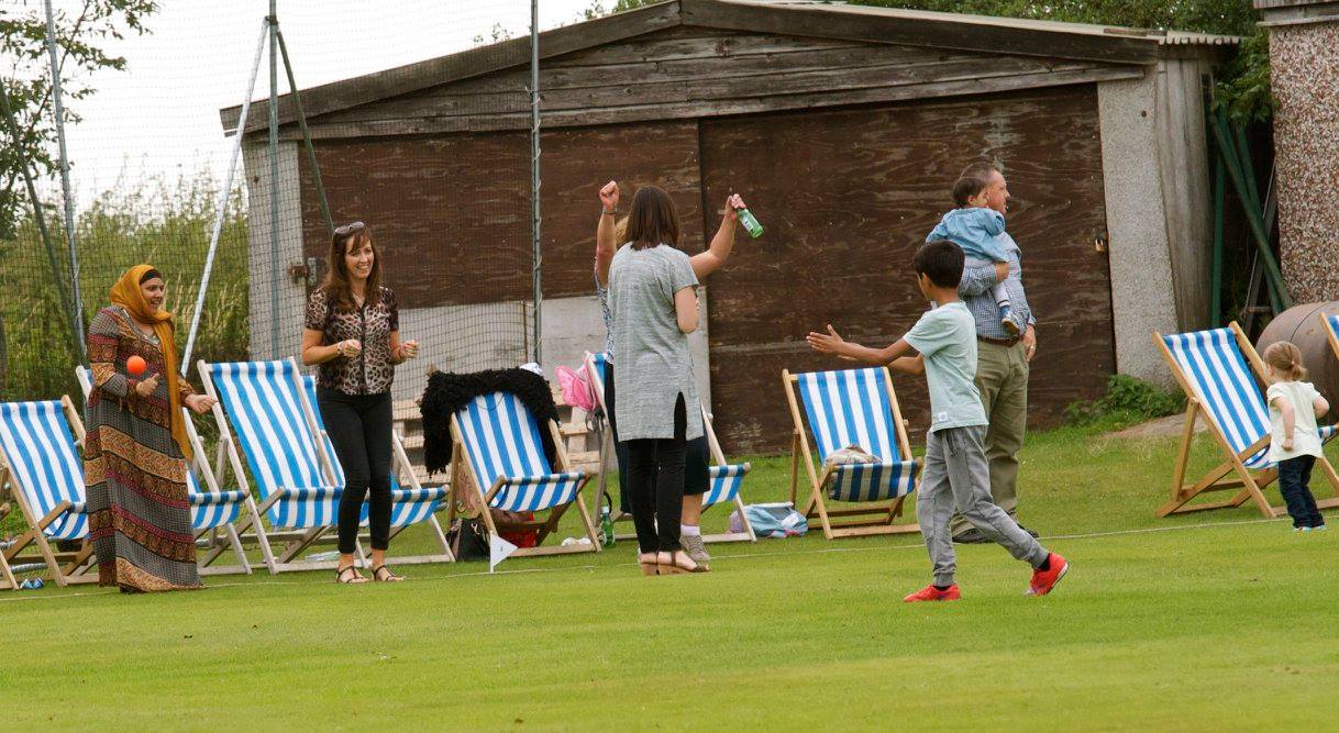
In response to the module as a whole I much preferred studio brief 1 which was self initiated. This is because I chose to complete multiple shorter briefs, therefore, I enjoyed the fast transitioning between briefs as it meant I did not get bored of the briefs and kept engaged in them. I also loved the interaction that this brief maintained such as meeting up with clients especially for the cricket flyers where I was able to actually visit the club itself as part of my primary research.
I felt that from completing the following module it allowed me to learn to stick to a restricted timetable to allow for all of my work for myself and clients to be completed on time but also to a professional standard. I have learnt that in the future branding is something I mostly enjoy particularly logo designs and exploring printing techniques. I also learnt that I love interacting with clients and being responsible for bringing clients ideas a reality.
If I was to re do the module again I would choose a collaboration which I would enjoy more. However, working with a copy writer and art director allowed me to be able to get a true feeling of what it is like working as a graphic designer in industry. This module made me feel I would much prefer to be an independent Graphic designer who focusing on freelance branding for smaller companies/ businesses.
Out of the following briefs I felt that Megan Callan's logo designs and the cricket flyers were the most successful. This was due to them exploring printing techniques giving the finals more of a professional finish whist holding a strong concept/ reasoning.
If I was to improve the following module I would allowed more congruency time for errors and allowed more time for final production. This was because I felt I spent too much of my time on initial ideas and research rather than diving my time equally for the entire process of the briefs.
Showing posts with label OUGD503 SB1. Show all posts
Showing posts with label OUGD503 SB1. Show all posts
Thursday, 14 February 2019
Monday, 4 February 2019
Will and Neave's Top Tips // Submissions boards
Online - 16:9, 1920x1080. Print - A3.
Text and Layout: Clear & Concise
Show your full range of products together
Show how things can be extended
Tips
Analyse brief
Keep writing brief max 200
Keep it relevant
Tell a story
Text and Layout: Clear & Concise
Show your full range of products together
Show how things can be extended
Tips
Analyse brief
Keep writing brief max 200
Keep it relevant
Tell a story
How to set out design boards/ what to include
Studio Brief 1.
- At least one set of design boards. ( 6 boards per set)
- Some boards may require more than one page
Studio Brief 2.
At least one set of design boards
Rationale
Communicate the reason behind the brief
outline the brief itself
Why is the brief relevant to you?
Include the brief on the rationale page
Collaboration - include contract
Say how long the brief took to make
Research
Key points of reference
Ensure you clearly communicate this - bold?
Subheadings
The source
Why it's relevant
How it will inform your development
Initial Ideas
How has researched informed your initial ideas?
A range of ideas - don't need to be developed at this stage
Scans of sketches, captions
Paragraph to evaluate thoughts
2 or more ideas on how you can tackle the project
Development
Images - Evidence of experimentation.
Development of testing some of your initial ideas
Focused development leading to final outcome
caption images - what you were trying to find out/ why. Refer back to research/ initial ideas
Summary/ evaluation work worked what didn't and why
Final Outcome
Photograph your outcome
Professional and convincing
Justification of design decisions based on the process you have evidenced on previous boards and why it led to this outcome.
Evaluation
Text based
Evaluation of briefs/ process
could refer to learning outcomes to help structure
what worked, what could be improved
1 evaluation for each studio brief.
Write to clarify images, no need for masses of writing on all boards. Don't over complicate the process.
Clarity !
Wednesday, 23 January 2019
WONDER // existing imagery and further research

Ted Carpenter was the illustrator for the existing book cover design of wonder.
She knew what she wanted though. “I told [Knopf] the direction… I wanted something iconic. For some reason I had kind of blue, black and white in my mind; and hand-lettered, but the rest [Knopf art department] kind of came up with.”
'My name is August. I won't describe what I look like. Whatever you're thinking, it's probably worse.'
'WONDER is a funny, frank, astonishingly moving debut to read in one sitting, pass on to others, and remember long after the final page.'


This beautiful special edition contains the original text of Wonder, and also its companion novel, Auggie & Me, which follows the stories of Julian, Charlotte and Christopher, and their relationships with the unforgettable Auggie Pullman.


365 DAYS OF WONDER is a beautiful companion to the novel: a collection of quotes and wise words, one for every day of the year.


Oscar nominated film starring Julia Roberts, Owen Wilson and Jacob Tremblay.
The film poster uses the font 'Coolvetica' for the title of the film.
Tuesday, 22 January 2019


Thursday, 10 January 2019
Existing cricket flyer designs
- Digital/ simplsitic
- Gloss coated / cheap looking
- Obvious imagery
- unprofessional
- Bold mainly using sans serif typefaces
- A6


Wednesday, 9 January 2019
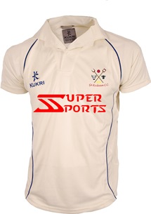
Research// Great Eccleston Cricket Club
Great Eccleston Cricket Club a popular club based in the
village of Great Eccleston around 5 miles inland from Blackpool. The club has
been in formation since 1876. They have three teams who play on a Saturday, one
on a Sunday and a midweek side who play in the Moore and Smalley Palace Shield
Competition. The club celebrated its centenary in the Palace Shield Competition
in 2006. The club also has a full junior section with sides at u17, 15, 13, 11
and 10. The club is situated on Hall Lane and is a real hub for the local
community. The club slogan is “Village Cricket at its Best”.
The club won the palace shield competition in 2006, 2008 and
2015 with the past 20 years seeing the clubs most on and off pitch success. The
club house was redeveloped into a modern open design in 2011 by the former
Blackpool and England football (and Great Eccleston Cricketer) Sir Jimmy
Armfield.
The club is very multicultural with players from a wide
variety of ethnic and socio diverse backgrounds. The club is very family
orientated with many social functions on throughout the year. It also has a bar
that is run during the summer months with strong links with the local
community.
The current kit designer is Kukari and has been for the last
5 years. The club is in an entirely amateur league with no players get any
remuneration for playing; this keeps the retention of local players as there is
not the allure of money elsewhere. It
also keeps the club string financially with all money going to grass roots. The
junior section is very large and successful with many players making the
transition from the younger sides into the adult ranks. The club crest was
redesigned 6 years ago to reflect the simplicity of the local cricket. The
crest simply contains two bulls and pitch forks. This represents the White
Bull, Black Bull and Farmers Arms which are the local pubs in the village; this
badge also reflects the rural location and farming community the club has had
historically had.


Saturday, 5 January 2019
Meeting up with Megan to discus the brief in person
- Competitors are other people in the music industry as it can be a competition to find bands/ artists suitable to create strong images from
- Megan claimed her audience is everyone as she did not want to restrict herself. However, currently I'd say my focus is young adults/ students mainly in the industry.
- Claimed her style is unique as she is known for her gel colours and Megan claimed this relates to her personality well which is colours and bubbly.
- Photographed a DJ set of the band slaves, local students such as horses in transits, snicklefritz, Owen Narton (a DJ which has just been signed) and the league singer of the band Venues who have also been signed.
- Megan claimed discussed that overall she wanted her logo design to instantly state 'photography' as she did not want to omit herself purely to the music industry.
Thursday, 3 January 2019
What makes a professional logo design ?
- A concept or 'meaning' should be behind an effective logo to be able to communicate the effective message
- A logo should be able to be printed to any size and should also be effective without colour
- Strong concepts and execution is needed for a strong logo design
Process of deigning a logo
Brief - Research - References - Sketching & conceptualisation - Reflection - revisions - presentation - delivery

Simple - recognisable, versatile, memorable, unique
Memorable - Keeping it simple yet appropriate
Timeless - You should consider if the logo will still be effective in 20 years time
Versatile - Consider is it one colour, the size of the postage stamp, would it be suitable for a large billboard?
Appropriate - How you position the logo should be appropriate for its intended audience

Monday, 31 December 2018

Monday, 17 December 2018
Introduction to OUGD503 - RESPONSIVE
Deadline - 15/7/19
- Innovation & technical competence 20%
- Problems analysis and resolution 20%
- Professionalism and project management 20%
One large brief
OR
Several smaller briefs
D&AD
YCN
ISTD
RSA
STARPACK - PACKAGING/ SUSTAINABLE
PENGUIN - BOOK COMPETITION (SMALL RESPONSIVE)
Collaborative brief - form to fill in so you are aware who is doing what
What's the problem?
What do you need to do?
What are your references?
Subscribe to:
Posts (Atom)
-
 The Following 9 typefaces are: -Berthold - Caslon - Helvetica - Baskerville - Times - Bondoni - Universe - Clarendon - ...

